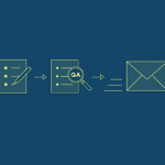
You’re almost ready to send out your survey.
You’re already thinking about the moment you receive the first responses and maybe some positive feedback about the great job you’ve done.
But hold up, Julius Caesar. Rome wasn’t built in a day and there’s still more you can do to make sure everything checks out before the final fireworks.
Don’t rush, breathe and take some time to make sure that everything runs smoothly. Here are 4 ways to QA those surveys!
1) Check the design
It seems obvious, but asking the right question is the only way to obtain the answer you want.
Make sure you’re choosing the correct question type for the kind of analysis you’re looking for. If you need to filter your results and analyze your respondents’ behavior in a survey, closed-ended questions are the ones that will achieve your goal without losing time (and hair).
If you need to collect a specific information in an open-ended question, like an email addresses or a date, make sure you’re obtaining the type of answer you were looking for by validating your question using a specific format.
Matching the validation with a clear Error message will also help your respondents to understand the type of answer you’re expecting from them.

In case you used some question or page skip logic, remember that testing is everything. Make sure to avoid some of the most common logic mistakes and check that your logic path is working well. You don’t want your respondents to see the questions you meant for somebody else.
2) Make sure your survey is user-friendly
There are some shrewd moves that can make your survey look user-friendly and will reduce the number of respondents who will run away from answering your questions.
The last thing you want is to scare your respondents with a long list of questions—we call that survey fatigue.
If your survey is on the longer side, remember to spread your questions out on several pages. It makes it easier for people to answer questions and can increase your rate of responses.
Splitting your survey into multiple short pages and making sure that each question (answer options and all) fits within one mobile device screen is a great way to charm your respondents on mobile. That way, they don’t have to do a lot of extra scrolling just to answer one question.
On the other hand, it’s also important to make sure respondents have enough room to easily read and answer your questions. If you’re asking respondents to write text into a comment box, make sure they’ve got enough space to read everything they wrote. You can do it by modifying the text box width in the options.
Similarly, if you’re using matrix questions, you can adjust the label width of your row choices to fit your needs.
You can also require the questions that are important to you. And why’s that important? You can prevent people skipping your most important questions.

3) Know your options
Taking a final look to what your survey options offer is the perfect way to give a touch of style to your survey before deploying it.
- If you’re creating your survey on behalf of your company, adding a logo can be a great way to communicate your brand identity and gain your respondents’ trust.
- If you’d like to give respondents an idea of how far they are in the survey, consider adding a progress bar.
- If your survey is in a different language you can make sure that the navigation buttons and the error messages in your survey matches the survey language.
Being consistent is a great way to please your respondents make their survey-taking experience an awesome one.
4) Preview and test (put yourself in their shoes)
It’s time for role swapping. See how it would feel to be on the other side of the survey. You can easily do it by testing your work before sending it out.
While the preview and test button in the design page is really helpful, don’t be afraid to think big. Why stop at the design page if you can have a taste of the entire survey experience as a respondent?
You can easily do it by creating a survey collector specifically for testing. Web link collector work well for this because you can allow multiple responses per computer, which allows you to run multiple tests.
After your tests are over you can simply remove the extra answers by clearing the responses in the survey collector. Otherwise, you can exclude them from your final analysis by setting up a filter to exclude that collector.
And don’t forget—you can always rename the test collector so you don’t confuse it with real collectors.
Curious about how to make these tips work for you? Try them out yourself. Discover more helpful tips for building a great survey.


